

Thoughts on evaluating the many art “rules” and traditions that continue to thrive in the studio and classroom.
(Updated 7/2026 for publication in Smartermarx Magazine)
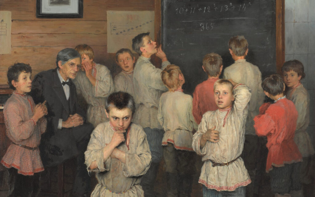
Cover: Nikolay Bogdanov-Belsky, Mental Arithmetic. In the Public School of S. A. Rachinsky, 1895. (cropped) Oil on canvas, 107.4 × 79 cm. State Tretyakov Gallery, Moscow.
“Art ‘rules’ are often personal opinions shouted loudly with a big stick.” -Kara Castro McGee.
American author Hilary Hinton “Zig” Ziglar is often credited with popularizing a clever story about blindly following tradition and dogma. The tale now exists in many versions, with numerous details changed, but the story’s core remains the same. Here’s how it appeared in Ziglar’s 1977 book, “See You at the Top.”: “In this respect, they are as bad as ‘this old boy down home.” His wife sent him to the store for a ham. After he bought it, she asked him why he didn’t have the butcher cut off the end of the ham. “This old boy,” asked his wife why she wanted the end cut off. She replied that her mother had always done it that way, and that was reason enough for her. Since the wife’s mother was visiting, they asked her why she always cut off the end of the ham. Mother replied that this was the way her mother did it; Mother, daughter, and “this old boy” then decided to call grandmother and solve this three-generation mystery. Grandmother promptly replied that she cut the end of the ham off because her roaster was too small to cook it in one piece.“
A story that I would guess fewer people are aware of is the one that immediately precedes the ham story. This one involves Processionary Caterpillars and is a little bit darker. It reads: “A man or a woman without a goal is like a ship without a rudder. Each will drift and not drive. Each will end up on the beaches of despair, defeat, and despondency. Jean-Henri Fabre, the great French naturalist, conducted a most unusual experiment with some Processionary Caterpillars. These· caterpillars blindly follow the one in front of them. Hence, the name. Fabre carefully arranged them in a circle around the rim of a flower pot so that the lead caterpillar actually touched the last one, making a complete circle. In the center of the flower pot, he put pine needles, which are food for the Processionary Caterpillar. The caterpillars started around this circular flower pot. Around and around they went, hour after hour, day after day, night after night. For seven full days and seven full nights, they went around the flower pot. Finally, they dropped dead of starvation and exhaustion. With an abundance of food less than six inches away, they literally starved to death because they confused activity with accomplishment. Many people make the same mistake and as a result reap only a small fraction of the harvest life has to offer. Despite the fact that untold wealth lies within reach, they acquire very little of it because they blindly, without question, follow the crowd in a circle to nowhere. They follow methods and procedures for no other reason than, “It’s always been done that way.” Some of you may be happy to know that Ziglar’s version of this story is a motivational retelling rather than a faithful account of Fabre’s observation. Fabre did report a circular procession that persisted for approximately seven days, but the procession eventually broke; he did not report that the entire group simply “dropped dead of starvation and exhaustion.” Fabre’s original account is available in The Life of the Caterpillar.
While these tales, and others like them, are often used to illustrate the folly found with a blind adherence to tradition, it should be understood that such traditions may persist because they have produced desired results, but they may also persist through conformity, authority, institutional inertia, selective memory, path dependence, or because their consequences have never been carefully compared with available alternatives. The processionary behavior of pine processionary caterpillars does have documented functions and provides an advantage in the real world. Trail-following helps individuals remain together while traveling between feeding sites and nests, and their collective defensive structures can deter predators. This supports the more modest conclusion that processionary behavior is useful in many ordinary circumstances. It does not establish that the behavior is indispensable to the species, because traits may persist for several evolutionary reasons and may become maladaptive when placed in what we might call an “unusual” environment. Likewise, the continued use of the grandmother’s ham recipe does not establish that removing the end improved the ham in any way. It establishes only that later cooks copied the procedure and apparently found the overall result acceptable. The success of the finished meal may have resulted from many other parts of the recipe.
Today, we find a good deal of such adherence to tradition and dogma in art schools, art academies, university art departments, and other educational resources. Laden with golden-age fallacies, traditional art “rules” thrive as aspiring creatives are eager to snatch up any bit of instruction that is made available without any sort of practical evaluation. Fortunately, as the age of information expands and educational resources become increasingly accessible, previously unchallenged dogma and tradition are now finding increased scrutiny — a change that has the potential to improve contemporary art education drastically.
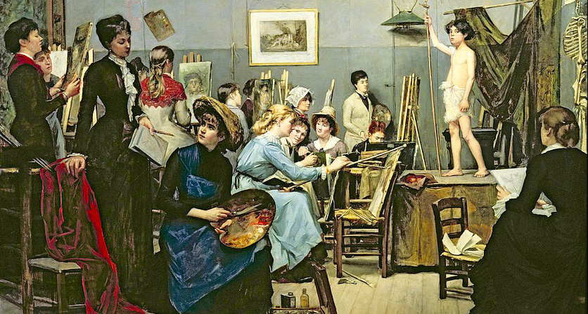
So how can one evaluate the many instructions and traditions that are celebrated, promoted, and passed along as unquestionable dogma in the classroom, studio, or other learning environment?
Fortunately, there are effective tools available to us for such evaluation. The most demonstrably reliable tools are those found within the arena of critical thinking. While the definition of critical thinking can vary, the term generally describes a structured, reasoned analysis of factual evidence to form a rational conclusion or judgment. The subject can be highly complex, but I could recommend no better toolbox for effectively evaluating the validity of available information.
Unfortunately, most of us do not invest a great deal of time learning or developing a large arsenal of critical thinking skills and instead rely on cognitive shortcuts called heuristics. A heuristic is a sort of mental shortcut or cognitive “rule-of-thumb” for use in problem-solving, learning, or discovery that employs a practical method with seemingly efficient rules that are not guaranteed to be optimal or perfect, but are relatively sufficient for immediate goals. These shortcuts, which often involve focusing on a single aspect of an issue, object, or concept and ignoring all others, can work well in many circumstances — but can also lead to systematic deviations from logic, probability, or rational thinking. In some contexts, heuristics can even be referred to as “convenient fictions.”
Two frequently studied heuristics are availability and representativeness. The availability heuristic occurs when people estimate the frequency, probability, or importance of an event partly according to how easily examples come to mind. For example, it is far more likely that a lottery ticket purchaser’s mind is filled with images of celebrating a colossal win than with actual statistics regarding the likelihood of winning. The representativeness heuristic occurs when people judge probability or category membership according to how closely something resembles a familiar prototype or stereotype. This can be useful as an initial guide, but it may also lead people to neglect base rates, sample size, relevant differences, and alternative explanations. Neither heuristic is inherently irrational; each can be useful under suitable conditions and misleading under others. In fact, when an optimal solution to a problem is impossible or impractical, heuristic methods can speed up the process or ease the cognitive workload of finding a satisfactory solution. As an educator, I often use heuristics to lay the groundwork for useful cognitive associations, increase processing fluency to ease cognitive workload amid increasingly complex activity, and establish strategic increases in cognitive processing speed. Examples of such heuristic use in my teaching career include treating circles in perspective as ellipses, treating specific colors as inherently primary (secondary, tertiary, etc.), and countless references to combining pigments or paints as “mixing colors.” Each of these treatments or statements is technically problematic in one way or another—but each has proven time and again to be very useful or advantageous in a specific context. The trick is not to confuse the usefulness of a heuristic with the actual facts of the matter, as such conflation can create a fertile ground for problematic traditions and practices to flourish.

A useful first step in evaluating new information is to distinguish truth from usefulness. A proposition is true when it accurately describes the relevant state of affairs—or “what is the case.” Its truth does not depend on whether it has been demonstrated, whether everyone accepts it, or whether it is useful. Evidence, justification, and consensus may give us reasons to accept a proposition, but they do not guarantee its truth. A claim may be true even when it has not yet been demonstrated or widely accepted, while a well-supported or widely accepted claim may later turn out to be false. This working distinction does not resolve every philosophical debate about the nature of truth, but it helps prevent truth from being conflated with usefulness, agreement, or present justification.
Usefulness, by contrast, is relative to a goal. A statement can be true yet unhelpful for a particular task, while a simplified or even literally inaccurate model can sometimes be useful within a restricted context. In empirical inquiry, it is usually better to speak of claims as being supported to varying degrees than to describe them as conclusively “proved”. There is no paradox in calling a statement useless for one purpose while using it successfully for another. “It will rain today, or it will not rain today” is true, but it offers little help to someone deciding whether to schedule an outdoor event. However, the same statement may still be useful in a lesson about tautologies, because its usefulness changes with the task.
A heuristic should therefore be evaluated along at least two dimensions: how reliably its outputs track the relevant features of a specified domain, and how effectively it helps achieve the intended goal. Because a heuristic is a rule of thumb or decision procedure rather than a factual proposition, it is not ordinarily true or false in the same way that a descriptive claim is. Its assumptions and accompanying explanations may be more or less accurate, while the judgments it produces may be more or less reliable. Some useful models and simplifications are literally inaccurate or deliberately idealized; these are sometimes described as “convenient fictions“. Their usefulness, however, should not be confused with literal truth or universal applicability.
Once truth and usefulness have been distinguished, effective evaluation also requires clarity. The meanings of terms can vary significantly from one context to another, and the art world—regardless of occasional claims to the contrary—does not operate with a single, universally standardized lexicon. We therefore need to make sure that we understand the instruction, rule, or claim being presented. One way to do this is simply to ask questions! In other words: PRACTICE THE ASK! Ask instructors or presenters to explain how they are using any term that remains even remotely unclear.
It is important to our purposes here to acknowledge that we inevitably interpret new information through the lens of our own assumptions, experiences, and associations. The more unfamiliar the information, the more care we should take to verify that we understand what is being proposed before attempting to analyze or evaluate it. One useful practice is to paraphrase a claim and ask its presenter whether the paraphrase is accurate. A related practice, often called “steelmanning“, is to reconstruct the strongest reasonable version of an argument before evaluating it. This may involve expressing the argument in clearer or more familiar terms, but it should not involve changing the claim into one the speaker would no longer recognize or endorse. Both practices reduce the risk of criticizing a position that was never actually intended.
With the basic concepts of truth, usefulness, and clarity in tow, we are now prepared to take the next step in effective evaluation: deploying the deceptively simple question “Why?” With this one word, we can move from the land of rote learning into the more demanding terrain of meaningful learning—a terrain populated by causes, reasons, purposes, justifications, and evidence. Asking why can help us form more useful and adaptable cognitive associations, synthesize information more effectively and efficiently, identify contextual and causal relationships, and reduce confusion as we navigate concepts such as truth, usefulness, clarity, heuristics, and tradition.
Importantly, the question “Why?” can request several different things: a cause, a reason, a purpose, a justification, or supporting evidence. Because many art rules are presented as claims about what will produce a particular result—and why—I will focus primarily on causal and probabilistic uses of the question. Keep in mind, however, that not every answer to a “why” question is a causal claim.
Causation concerns the relationship between factors that help bring about an outcome and the outcome itself. Causes may take the form of events, conditions, processes, states, or sometimes even absences. Temporal order and association may provide evidence of causation, but they do not establish it by themselves. Evaluating a causal claim also requires attention to alternative explanations, relevant background conditions, possible mechanisms, comparison cases, and, where available, experimental or counterfactual evidence. For our purposes, we can begin navigating causal claims by distinguishing among necessary conditions, sufficient conditions, and contributory or component causes. Necessary and sufficient conditions are, strictly speaking, logical relations between conditions; describing a condition as necessary or sufficient does not by itself establish that it is a cause. Here’s a walkthrough of some of these ideas:
Condition A is necessary for condition B when B cannot occur without A. In other words, if B occurs, A must also be present; equivalently, if A is absent, B cannot occur. Infection with an influenza virus, for example, is necessary for influenza illness. Mere exposure, however, is not the necessary condition: a person may be exposed without becoming infected. Infection is also not sufficient for symptomatic influenza, because some infections remain asymptomatic. A necessary condition must be present for the outcome to occur, but its presence does not guarantee the outcome.
Condition A is sufficient for condition B when the occurrence of A guarantees the occurrence of B within the stated scope and contextual conditions. Surprisingly, sufficiency is not “stronger” than necessity as the two concepts answer different questions. A necessary condition asks what the outcome cannot occur without, whereas a sufficient condition asks what would be enough to ensure the outcome.
Strict sufficiency is easy to illustrate in logic: being a square is sufficient for being a rectangle, although it is not necessary, since many rectangles are not squares. Causal sufficiency is more difficult to isolate because outcomes usually depend on several background conditions. Striking a match, flicking a lighter, or focusing sunlight through a magnifying glass is not, by itself, sufficient for fire. Each also requires suitable fuel, adequate oxygen, sufficient heat, and other favorable conditions. An ignition source may instead be one component of a larger set of conditions that is jointly sufficient for combustion.
A contributory or component cause is one factor that helps produce an outcome but does not usually produce it by itself. For example, a match may help start a particular fire, but only when other conditions—such as fuel and oxygen—are also present. The match is not necessary for every fire, because fires can begin in other ways, and it is not sufficient on its own. In complex situations, the full combination of conditions may be sufficient even though no single factor is. A factor’s role may also change with the circumstances: it may be necessary in one case, merely contributory in another, or simply make an outcome more likely.
Most practical claims in art instruction are probabilistic rather than strictly necessary or sufficient. A practice may increase the likelihood of a desired result under certain conditions without guaranteeing it. It may also help produce that result as one factor among many. So in terms of practicality, when our deployment of “Why?” is met with an appropriate reason or rationale, we can continue the evaluation by asking:
Is the rationale clear?
What kind of answer is being offered: a cause, a reason, a purpose, a justification, or evidence?
If appropriate, is it true?
Are its factual claims adequately supported?
Is the rationale relevant and useful for the stated goal?
Does the reasoning contain an identifiable fallacy, ambiguity, inconsistency, or unsupported inference?
If it proposes a causal relationship, what exactly is being claimed? Is the factor supposed to be necessary, sufficient, contributory, or merely associated with an increased probability of the result?
Have relevant background conditions, alternative explanations, and possible confounding factors been considered?
Does the strength and scope of the conclusion match the strength and scope of the evidence?
Let us apply these concepts and questions to several common instructions—or “rules”—that an art student may encounter in a teaching studio or classroom. I will follow each rule or instruction with one cited rationale. This is not to suggest that the selected rationale is the only or strongest defense available. Rather, I have chosen rationales that I believe will be productive for this exercise. I have also included a simplified version of each rationale to increase clarity. In doing so, I will attempt to preserve the original claim’s scope and degree of certainty. A statement that something “may” or “can” produce an effect should not be reformulated as a claim that it “must,” “always,” or “necessarily” produces that effect.
Omit black paint from your palette.
WHY: “Monet’s paintings evoke a sense of energy and life; they leap off the canvas with color and contrast, but Monet somehow managed to avoid using the color black for nearly his entire painting career. By avoiding black in your own designs, you can replicate some of this dynamism.” –David Kadavy, Design for Hackers

SIMPLIFIED: The omission of black is presented as one cause of Monet’s perceived dynamism and as a practice other artists should adopt to reproduce some of that effect.
In the interest of fair analysis, I would recommend reading the entire article that is cited and linked, as there are additional reasons given for avoiding black, including one claim that states that ” The impressionists avoided black not only because it nearly doesn’t exist in nature, but because the effects caused by changes in hue are so much richer than those caused by changes in shade.“
Ummmm…
However, as stated above, for our purposes here, we will limit our focus to the rationale that was extracted and simplified.
First, regarding clarity, there is a significant amount of flowery, nebulous language here. I have no way to usefully validate or gauge claims about energy, life, and “leaping-off-of-the-canvas” effects in this context. It sounds nice, but is it clearly communicating anything? Are the statements made in the rationale factually correct? There is indeed evidence to support the claim that Monet avoided black in many of his works. Additionally, I would concede that some probably have described Monet’s works as “evoking a sense of energy and life” and as having an ability to “leap off the canvas with color and contrast.” Let’s say for the sake of argument that this is also true. Does that mean that what follows is also likely to be true? (“By avoiding black in your own designs, you can replicate some of this dynamism.”)
The basic structure of the author’s rationale is:
Monet often avoided black.
Monet created paintings that many viewers describe as energetic, lively, or dynamic.
Therefore, avoiding black may help other artists reproduce some of this dynamism.
Honestly, the conclusion is possible, but the premises provide very little evidence for it. The fact that Monet avoided black and produced paintings perceived as dynamic does not establish that the first feature caused the second. Many other characteristics of his work may contribute to that response: hue and value relationships, simultaneous contrast, brushwork, broken color, edge variation, compositional organization, scale, subject matter, and the juxtaposition of relatively unmixed pigments.
What we find here, then, is a weak causal inference drawn from an extremely limited example. Monet’s practice gives us a possible hypothesis: perhaps restricting black can encourage color relationships that some viewers experience as more vibrant or dynamic. But the rationale provides no comparison showing that the omission of black itself produces that effect, how much it contributes, whether it does so reliably, or under what conditions it should be expected to work. The mere coexistence of two features in Monet’s paintings has been packaged as an explanation of the relationship between them. The author’s carefully qualified statement that avoiding black “can” reproduce “some” dynamism does not, by itself, claim that omitting black is either necessary or sufficient. The title and broader argument of the specific writing being addressed here, however, turn this weak hypothesis into a general prescription: Why Monet Never Used Black, & Why You Shouldn’t Either. It is this stronger rule—the one frequently repeated in classrooms—that fails badly when examined in terms of necessity and sufficiency.
The absence of black is clearly not sufficient to produce dynamism. At the most obvious level, a blank canvas contains no black and possesses none of the energy, life, or “leaping-off-the-canvas” effect attributed to Monet. More importantly, countless completed paintings made without black can still appear dull, weak, muddy, or lifeless. Merely removing one pigment does not produce Monet’s results. The absence of black is also not necessary for dynamism. Paintings containing black can still appear energetic, vivid, luminous, dramatic, or full of life. Nothing in the rationale establishes that black prevents those effects or that its omission is required to achieve them.
These observations do not disprove the modest possibility that avoiding black may sometimes contribute to a particular effect. They do, however, demolish the stronger classroom rule that black should generally be excluded because its absence produces dynamism or because its presence prevents it. Nor does the rationale establish that avoiding black will produce comparable results outside the context of a Monet-like Impressionist approach. Even someone deliberately attempting to imitate Monet would need to consider far more than the mere absence of black. Monet’s effects depend on an interconnected network of decisions involving color relationships, value, brushwork, edges, composition, atmosphere, subject matter, and paint handling. Removing one pigment from the palette does not reproduce that network.
There are nevertheless many valid reasons to omit a particular paint from a palette. The color may be irrelevant to the subject, incompatible with a desired mixing strategy, poorly suited to the painter’s process, or deliberately excluded as part of a productive exercise. An instructor may prohibit black to encourage chromatic mixtures, prevent students from darkening colors too quickly, imitate a historical palette, or make them more attentive to hue relationships. These are legitimate, goal-dependent reasons for imposing the restriction. The critical difference is that these explanations identify what the restriction is intended to accomplish. “Do not use black because Monet did not use it” merely borrows Monet’s prestige while leaving the alleged causal relationship unestablished.
All in all, this painting “rule,” as presented here, is a textbook example of how a fragment of historical truth, evocative language, the prestige of a celebrated painter, and an unsupported causal leap can provide the seeds for an often unquestioned tradition. The recommendation may still be useful for particular goals, but its usefulness depends on those goals and on a clear explanation of what the restriction is intended to accomplish. You would be wise to keep an eye out for this pattern.
Paint “Fat over Lean.”
WHY: “The ‘fat over lean’ rule allows you to build a painting that is flexible, so over time, there will be less cracking to your painting. The under layers of a painting should be leaner than the upper layers.” –Gamblin Colors.

SIMPLIFIED: In a multilayer oil painting, arranging the layers so that upper layers remain at least as flexible—and generally no faster-drying—than the layers beneath them can reduce one source of cracking risk.
In stark contrast to the last “rule” we examined, this is a fairly straightforward piece of instruction that uses reasonably clear terms and points toward an identifiable material mechanism. Gamblin does not claim that following the rule will eliminate cracking altogether, only that it may result in “less cracking.” That distinction matters. The information also comes from a source with substantial expertise in artists’ materials. Such expertise makes Gamblin’s guidance relevant evidence, although it should not be treated as conclusive proof. An appeal to expert opinion is reasonable when the source possesses relevant expertise, speaks within that area of expertise, and offers guidance consistent with the available evidence. It becomes problematic when expert testimony is treated as infallible, substituted for evidence altogether, or extended beyond the conditions under which the advice applies.
There is good evidence that the flexibility, stiffness, shrinkage, and relative movement of paint layers can influence the likelihood of cracking. When a drying oil is exposed to oxygen, it undergoes autoxidation and begins forming a crosslinked polymer network. That initial drying process may make the paint feel dry within days or weeks, but chemical and mechanical changes continue for years and, in some respects, throughout the life of the painting. These later changes are more complicated than continual crosslinking alone. They may include further oxidation, crosslinking, hydrolysis, the loss or migration of low-molecular-weight components, and reactions between the oil binder and pigments. Together, these processes can alter the paint film’s stiffness, strength, flexibility, adhesion, and response to environmental change. Many oil paints gradually become stiffer and more brittle, although the rate and extent of that change depend heavily on pigment, binder, additives, layer thickness, pigment concentration, environmental history, and other variables.
Paintings are also layered mechanical systems. Grounds, paint layers, varnishes, fabrics, and wooden supports do not necessarily expand, contract, stiffen, or absorb moisture at the same rates. Changes in temperature and relative humidity, support movement, continued drying, and chemical aging can therefore create stress within and between layers. When those stresses exceed the strength, flexibility, or adhesion of the paint system, the result may be cracking, wrinkling, cupping, cleavage, or delamination.
Scottish chemist and author A. P. Laurie explained the bones of the strategy in his 1926 text The Painter’s Methods and Materials (Chapter 10). He writes:
“During this process, the oil film is not only absorbing oxygen and therefore increasing in weight, but is also losing certain volatile products of the oxidation, thus losing weight. If a thin film of the oil is painted out on glass and weighed from time to time, it will be found to increase in weight in passing from liquid to sticky and then from sticky to surface dry. It now begins to lose in weight, the rate of loss slowly diminishing. An increase or decrease in the weight of the paint film represents an equivalent change in the dimension of the paint film. If the changes in dimension of the under layer are considerably greater than the top layer, it is inevitable that the top layer will become disfigured as a result.”
Laurie’s account captures the central concern: continuing changes in an underlying layer can place stress on a less accommodating layer above it. Modern conservation science, however, shows that the relationship among weight change, dimensional change, stiffness, drying, and cracking is not as direct or universal as this passage suggests. Different paints can undergo very different chemical and mechanical changes even when their apparent oil contents are similar. The traditional “fat over lean” rule is one attempt to reduce these incompatibilities. In general, a fatter paint contains more binder relative to pigment, while a leaner paint contains less. Increasing the binder-to-pigment ratio—equivalently, lowering the pigment volume concentration—may produce a more flexible film under some conditions. It may also slow drying and allow an upper layer to accommodate some movement in the layers below.
But “add more oil or medium” is not a universally safe formula. Different pigments have different oil requirements, and different mediums can alter drying rate, flexibility, gloss, adhesion, yellowing, wrinkling, and film strength in very different ways. Excessive oil can introduce problems of its own. The practical principle is therefore broader than the slogan: avoid placing a comparatively brittle, rapidly drying, highly contracting, or mechanically incompatible layer over one that remains more flexible or continues to move.
Viewed causally, “fat over lean” is best understood as a contributory risk-reduction practice. It is not sufficient by itself to ensure less cracking, because many other variables affect whether a painting develops cracks. Nor is it necessary for every durable oil-painting method. A well-constructed painting may remain stable through thin applications, compatible materials, adequate drying time, a rigid or stable support, suitable pigment choices, controlled medium use, and favorable environmental conditions without relying on a simple progression of increasingly oily layers. Pigment choice alone can sometimes overwhelm the benefits of otherwise careful layer construction. Zinc oxide, for example, has been associated with brittle paint films, zinc-soap formation, cracking, delamination, and other forms of deterioration. Layer thickness, solvent use, support movement, drying time, environmental fluctuations, and the particular oils and additives present may also significantly increase or decrease risk.
This is why recent technical discussions often caution artists to follow the “spirit” of the rule rather than relying on an oversimplified calculation of fat and lean. Sarah Sands from Golden Artist Colors writes: “Oil painters concerned with fat over lean will often turn to information about the oil absorption values for particular pigments as a way to compare how oily or lean certain colors might be. However, this has led to many misconceptions and outrightly wrong conclusions, which seem to persist in various forums and articles. In what follows, we try to correct this and show how using the actual ratio of the volume of pigment to oil, rather than the weight, gives a far more accurate picture and is usually what people have in mind when wondering about the amount of oil in any one particular color.” Natural Pigments founder, George O’Hanlon, writes, “…[fat over lean] is typically difficult to achieve in practice. Most artists don’t understand what constitutes fat or what is lean. It is impractical to measure the ratio of pigment and binder while painting. What I will tell you next may sound heresy, but you do not need to follow this rule if you use paint at its CPVC, which is applying paint straight from the tube, and paint thinly. On the other hand, working in thick paint layers and/or with lots of medium or oil added to paint requires one to observe the fat-over-lean rule.“
In summary, this piece of instruction is broadly sound when understood as a context-sensitive strategy for reducing one source of cracking risk. Unlike the Monet-inspired argument for omitting black, it is not built primarily from the prestige of a celebrated artist or from an unsupported association. It is grounded in observable chemical and mechanical behavior and supported by multiple lines of materials research. The rule should not, however, be presented as a guarantee. A more accurate formulation would be:
In a multilayer oil painting, avoid placing a comparatively brittle, faster-drying, or less flexible layer over one that remains more mobile. “Fat over lean” is one traditional method of reducing that incompatibility, but its success depends on the pigments, binders, mediums, thicknesses, drying times, support, and working methods involved.
On a quick side note, I recommend consulting multiple sources when investigating any technical instruction. Even though I have represented “fat over lean” to the best of my ability, the claims presented here should be independently checked against conservation research and qualified materials specialists. Useful resources include The Natural Pigments Forum, Smithsonian Museum Conservation Institute, and Golden Artist Colors’ Just Paint.
Follow the Rule of Thirds to find an ideal focal point placement.
WHY: “The rule of thirds dictates that if you divide any composition into thirds, vertically and horizontally, and then place the key elements of your image along these lines or at the junctions of them, the arrangement achieved will be more interesting, pleasing, and dynamic.” –Chris Legaspi, Creativebloq.com

The rule of thirds can be found in just about every contemporary resource involving pictorial composition. As we can see in the chosen rationale above, the rule proposes that an image be divided into nine equal parts by two equally spaced horizontal lines and two equally spaced vertical lines. Important compositional elements are then placed along those lines or near their intersections for an alleged aesthetic advantage.
SIMPLIFIED: Placing important pictorial elements along third lines or near their intersections will make the resulting composition more interesting, pleasing, and dynamic.
Regarding clarity, most of the instruction is reasonably straightforward. We know where the lines and intersections are supposed to be, and we know what action the artist is being told to take. The promised result, however, is far less clear. As with the earlier claims about Monet’s “dynamism,” terms such as “interesting,” “pleasing,” and “dynamic” may identify recognizable aesthetic responses, but the rationale gives us no criteria by which to measure or compare them. For the purposes of this discussion, I will treat the phrase as a general claim about aesthetic preference: following the rule is supposed to increase the likelihood that viewers will respond positively to the composition. This interpretation does not eliminate all of the ambiguity, but it gives us something that can at least be investigated.
Before examining the evidence, it is useful to look at the rule’s history. The earliest known use of the phrase “rule of thirds” appears in John Thomas Smith’s 1797 publication Remarks on Rural Scenery. Smith was primarily discussing unequal divisions of light, shade, and pictorial area. He argued that equal divisions could compete awkwardly for attention, whereas unequal divisions could establish hierarchy:
“Two distinct, equal lights, should never appear in the same picture: One should be principal, and the rest subordinate, both in dimension and degree: Unequal parts and gradations lead the attention easily from part to part, while parts of equal appearance hold it awkwardly suspended…”
Smith later wrote:
“Analogous to this ‘Rule of thirds’—if I may be allowed so to call it—I have presumed to think that…in a design of landscape, to determine the sky at about two-thirds; or else at about one-third, so that the material objects might occupy the other two.”
Smith’s proposal was therefore concerned largely with unequal proportion and the subordination of one pictorial area to another. It was not yet the familiar modern instruction to place focal objects on four supposedly privileged intersections. The contemporary rule appears to have expanded Smith’s proportional suggestion into a more rigid spatial armature. That distinction matters. The historical existence of a two-thirds-to-one-third recommendation does not establish that the four intersections of a modern three-by-three grid possess any special aesthetic power. Nor does the observation that some successful paintings contain divisions near a one-third proportion demonstrate that the proportion caused their success. Artists can impose a thirds grid on an enormous number of existing images after the fact and discover some element that falls near one of its lines. That kind of retrospective fitting provides little evidence for the rule.
Fortunately, researchers have begun testing some of the rule’s central predictions directly.
In a 2014 Vision Sciences Society presentation, Stephen Palmer, Yurika Hara, and William Griscom examined preferences for the placement of a single object at the nine positions formed by the intersections of third-lines and central symmetry axes. Their stimuli included a fish, dog, and eagle facing forward, leftward, or rightward. Participants made forced choices between different placements of the same object.
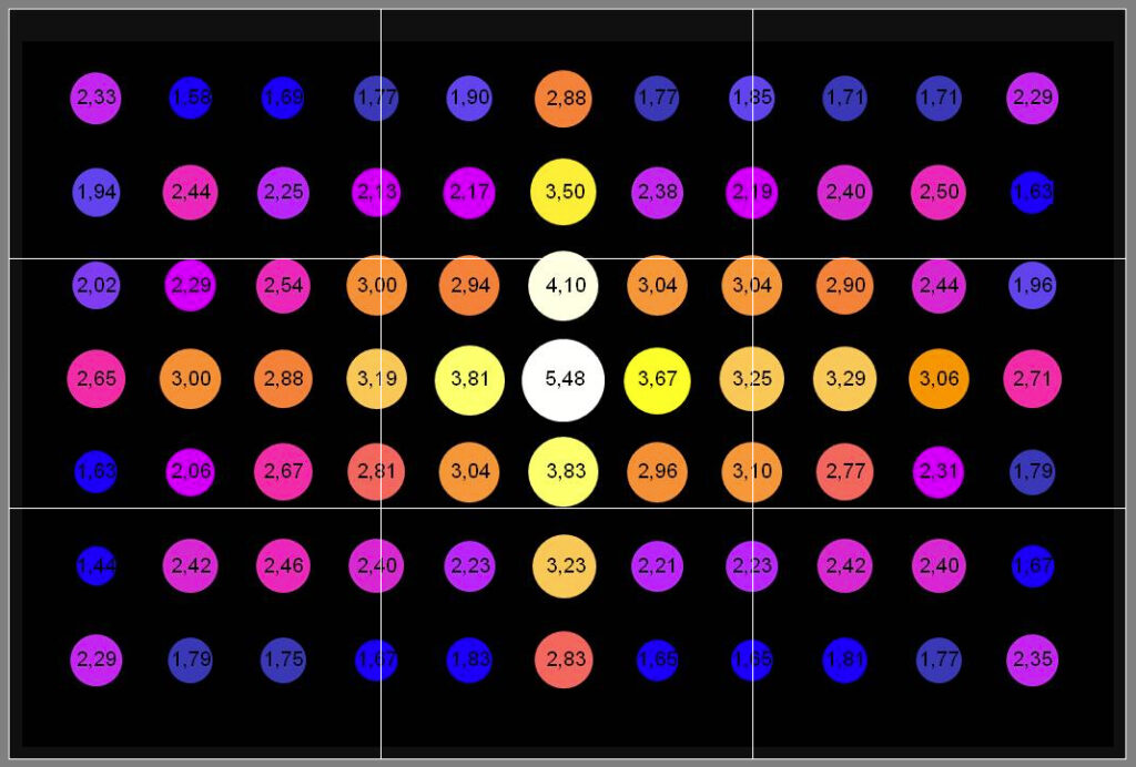
The rule of thirds predicts that the four third-line intersections should be especially desirable and that the central vertical and horizontal axes—particularly the exact center—should be comparatively poor locations. The reported results strongly contradicted those predictions. Third-line intersections were not generally preferred, and the center was not generally the least desirable location. This is a direct problem for the strong version of the rule. If the grid identifies generally superior focal-point locations, those locations should perform reliably better than the positions the rule tells us to avoid. In these experiments, they did not.
The scope of the experiment should nevertheless be stated accurately. It tested preferences for a single isolated object at nine predetermined locations. It did not test complete landscapes, portraits, narrative paintings, multi-object arrangements, or every possible use of a thirds division. The results therefore contradict the rule’s general placement predictions within the tested conditions; they do not prove that no composition can ever benefit from placing something near a third-line. However, additional research can help explain why the rule performs so poorly as a universal prescription.
In 2011, Stephen Palmer and Stefano Guidi investigated the perceptual structure of rectangular frames by asking participants how well a small circular probe seemed to “fit” at different locations. The highest goodness-of-fit ratings occurred at the center. Ratings were also elevated along the rectangle’s horizontal and vertical symmetry axes and, to a lesser extent, along local symmetry axes extending from its corners.
These findings are relevant because they show that viewers do not treat every point within a rectangular frame as structurally equivalent. The center and symmetry axes can be perceptually powerful locations—the exact opposite of what many descriptions of the rule of thirds imply. However, this study should not be misrepresented as a direct measurement of artistic beauty. Participants judged how well a simple circle fit within a rectangle; they did not judge complete pictures as “interesting, pleasing, and dynamic.” The study provides evidence about the perceived structure of rectangular frames, not a comprehensive theory of pictorial composition.
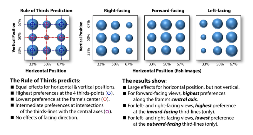
A related set of experiments by Palmer, Gardner, and Wickens in 2008 examined the placement of single objects within rectangular frames. For front-facing objects, preference was generally highest when the subject was at or near the center and decreased as it moved farther away. The researchers called this the center bias. For objects with a clear facing direction, another preference emerged. When an object was positioned away from the center, viewers generally preferred it to face inward, toward the open area of the frame, rather than outward toward the nearest border. This is known as the inward bias.
Both findings create problems for the rule of thirds as a self-contained explanation of aesthetic placement. A centered front-facing subject may be preferred even though many presentations of the rule treat the center as the worst possible location. Conversely, an off-center subject may look successful not because it occupies a mathematically privileged third-point, but because its position leaves space in the direction it faces. The rule can therefore appear to “work” when it accidentally aligns with a more relevant compositional relationship. Placing a person near one third of the frame may leave open space in the direction of that person’s gaze or movement. The success of the placement may then be attributed to the thirds grid when the more important factor is the relationship between the subject’s orientation and the surrounding space.
Research by Sammartino and Palmer has shown that vertical preferences are similarly sensitive to the nature of the depicted object and its typical position relative to the observer. Side views of objects normally encountered below the observer, such as bowls or swimming stingrays viewed from above, were generally preferred below the center of the frame. Objects normally encountered above the observer, such as ceiling fixtures or flying eagles, were generally preferred above the center. The authors interpreted these results partly in terms of keeping the object’s “affordance space” nearer the center of the frame.
The center bias should also be distinguished from central fixation bias. Central fixation bias refers to the tendency of observers to begin viewing or disproportionately inspect a scene near its center. It has been observed in numerous eye-tracking studies. That tendency may be related to centered compositional preferences, but evidence for one should not automatically be treated as an explanation of the other. Likewise, the inward bias should not be explained too quickly through the popular idea that the brain is a “prediction machine.” Research on implied motion shows that still images can convey information about movement and possible future position. But to be fair, that does not, by itself, demonstrate that predictive processing causes the inward bias. The inward preference may involve anticipated movement, attentional balance, affordance space, learned conventions, discomfort with objects appearing to exit the frame, or some combination of factors. Until the mechanism is established, these possibilities should be treated as compelling hypotheses rather than settled explanations.
So can adherence to the rule of thirds be shown to make a pictorial arrangement more likely to elicit a positive aesthetic response?
Not as a general rule.
The rule is not sufficient for aesthetic success. Merely placing an object on a third-line or intersection does not guarantee that a composition will be interesting, pleasing, dynamic, balanced, legible, or effective. A poorly chosen subject, awkward scale, confusing hierarchy, inappropriate direction, weak value structure, or distracting background will not be rescued by placement on a grid. The rule is not necessary for aesthetic success either. Countless admired works place important elements at the center, near an edge, along a diagonal, in symmetrical arrangements, or in positions that do not meaningfully conform to a thirds armature. More importantly, the direct experimental findings discussed above challenge the rule’s central predictions. Third-line intersections have not been shown to possess a general aesthetic advantage, while positions that the rule often discourages—especially the center and central symmetry axes—can be strongly preferred under appropriate conditions.
This does not mean that the rule can never be useful. It may serve as a simple prompt for students who habitually place every subject dead center without considering alternatives. It can encourage asymmetry, create unequal divisions, prevent a horizon from mechanically bisecting a picture, or remind an artist to consider the relationship between a focal object and the space around it. But these are pedagogical uses of a grid, not evidence that the grid identifies ideal focal-point locations. When a thirds-based arrangement succeeds, it may do so because it establishes hierarchy, creates useful asymmetry, supports an inward-facing subject, provides space for movement, or aligns with some other context-sensitive relationship. The success should not automatically be credited to the mathematical division itself.
The strongest evidence therefore supports a direct conclusion: the rule of thirds should not be taught as a law of aesthetic composition, as a map of inherently superior locations, or as a reliable method for making an image more interesting, pleasing, and dynamic. Controlled studies of object placement contradict its primary predictions, and its apparent successes can often be explained more effectively through other compositional factors. At most, the rule is a notably limited heuristic—a quick device that may prompt an artist to explore certain kinds of asymmetry or spatial division. Used that way, it can be productive. Presented as an aesthetically privileged armature, however, it claims far more than the evidence supports.
All in all, the rule of thirds illustrates how an observation about unequal pictorial divisions can gradually harden into a universal prescription. Repetition, simplicity, and familiarity can make the rule feel self-evident, but none of those qualities establishes its truth. Artists would be better served by asking what a particular placement accomplishes in relation to the subject, frame, visual hierarchy, direction, balance, and intended effect than by assuming that four arbitrary intersections possess aesthetic power.
For those interested in the research referenced here, I would recommend these additional studies related to the Rule-of-Thirds (ROT):
Sammartino, J., Palmer, S.E. (2012). Aesthetic issues in spatial composition: Effects of vertical position and perspective on framing single objects. Journal of Experimental Psychology: Human Perception and Performance, 38(4), 865-879.
Palmer, S. E., Gardner, J. S., & Wickens, T. D. (2008). Aesthetic issues in spatial composition: Effects of position and direction on framing single objects. Spatial Vision, 21, 421-449.
Palmer, S. E., & Guidi, S. (2011). Mapping the perceptual structure of rectangles through goodness-of-fit ratings. Perception, 40(12), 1428-1446.
Artists should not “Paint from Photos.”
WHY: “The camera cannot see like the eye can when it comes to color accuracy, depth of field, and the warms and cools of highlights and shadows. There’s a lot of distortion that comes along with photographs.” —Mark Haworth, Artists Network
SIMPLIFIED: Because photographs alter or omit some of the color, focus, and spatial information available during direct observation, avoiding them is presented as a way to obtain a more accurate and less distorted reference.
The rationale is communicated clearly enough, but it combines a defensible observation with an unjustified general conclusion. Cameras and human visual systems do not merely process light in somewhat different ways; beyond a limited set of front-end optical similarities, they are fundamentally different kinds of systems. A camera records and encodes patterns of light. Human vision uses changes in photoreceptor activity as inputs to an active, embodied, context-sensitive process that generates perceptual experience and guides behavior. The comparison is therefore less like comparing two versions of the same instrument and more like comparing apples and oranges. The familiar camera analogy for human vision remains tempting because both systems use optical structures to focus light onto arrays of photosensitive receptors. Both are sensitive to spatial and spectral variation, and both operate within limited ranges. But these similarities occur only at the earliest stages of information acquisition. They do not establish that vision functions as an internal camera or that perceptual experience resembles a photograph recorded somewhere in the brain.
A digital camera records light during a fixed exposure through a particular lens, aperture, focus setting, and sensor configuration. Its output is then constructed through processes such as white balance, sharpening, noise reduction, compression, and display rendering. The resulting photograph is a stable image encoded from a particular optical event. Human vision operates very, very differently. Retinal stimulation is only the beginning of a continuously changing process involving extensive neural transformations. Fine spatial detail is confined largely to the center of gaze, visual sensitivity varies dramatically across the retina, and our apparently broad and stable visual world is assembled through repeated sampling and active exploration. Neuroscientist and author Beau Lotto points out that human vision is actually more akin to a computer keyboard than a camera. A keyboard does not contain or reproduce the meanings, images, or experiences generated through its use; it provides patterned inputs that a larger system interprets according to its structure, history, and current state. In much the same way, retinal signals do not constitute a picture of the world. They are inputs from which the visual system constructs an experience useful for guiding behavior.
The eye–camera comparison is therefore informative only at a very restricted optical level. Once the discussion turns to perception, color, depth, attention, meaning, or experienced visual space, the analogy quickly breaks down. Treating photography as a deficient version of human vision—or human vision as a biologically superior camera—misrepresents both. The resemblance is therefore limited primarily to front-end optics and photosensitivity. Beyond those early stages, the systems diverge profoundly.
Color experience should not be confused with the physical conditions that contribute to it. Surfaces have measurable spectral reflectance properties. Illumination has a measurable spectral power distribution. Cameras and visual systems have certain measurable spectral sensitivities. But experienced redness, blueness, warmth, coolness, brightness, and saturation are not intrinsic ingredients sitting inside external objects waiting to be collected (although some existing color materialists may claim otherwise). Human color experience arises from relationships among illumination, surface reflectance, surrounding stimuli, the observer’s photoreceptors, adaptation, opponent processing, and an incredibly complex array of subsequent neural activity. The same physical stimulus can produce different color experiences in different contexts, while different spectral distributions can sometimes produce matching color experiences. A so-called warm or cool passage is therefore not simply extracted from the world as though the visual system were reading a label attached to the object.
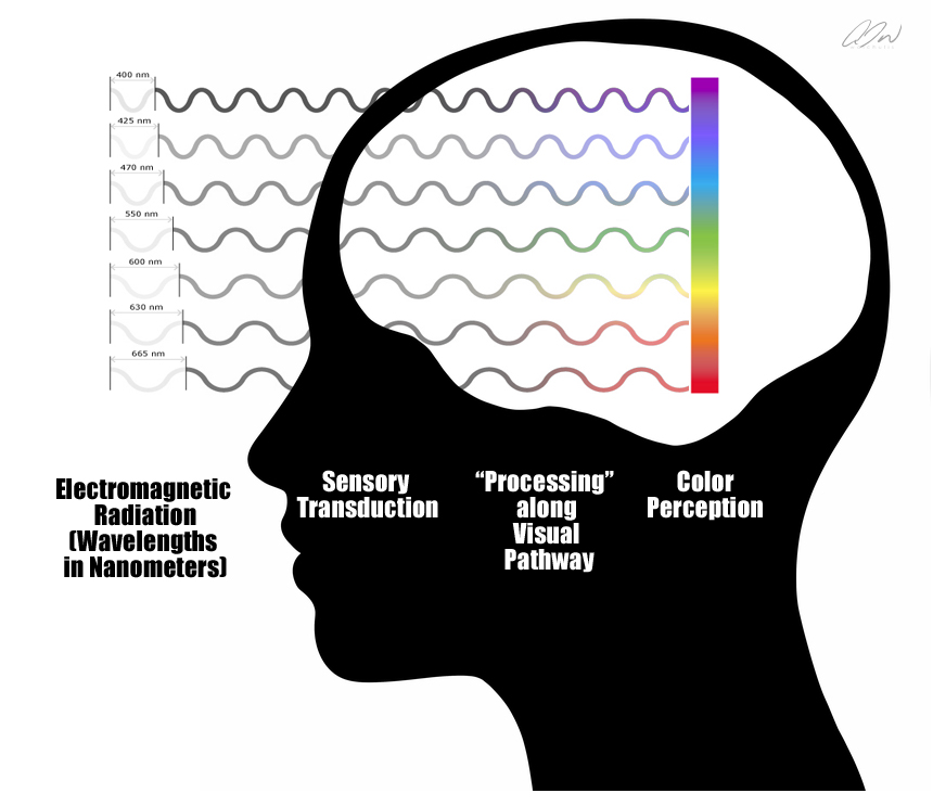
Nevertheless, it would be a mistake to conclude that the term “accuracy” cannot apply to color. Accuracy becomes meaningful once a target or standard has been identified. We might ask how closely a photograph reproduces a stimulus defined by measured colorimetric values, the appearance of a scene under specified viewing conditions, the spectral reflectance of a surface, the report of a particular observer, or the artist’s intended result. These are different standards, and a photograph may perform better under one than another. A photograph may alter value or color through exposure, white balance, sensor sensitivity, clipping, compression, limited dynamic range, display gamut, and automatic image processing. Its perceived appearance can also change with the display and ambient viewing conditions. An observer’s live percept also changes with adaptation, contextual surround, fatigue or habituation, and individual physiology. Neither source provides an unmediated or context-free reading of some objective reality.
The useful question is therefore not whether a photograph or a live percept is inherently “more accurate.” The useful question is: accurate with respect to what?
If an artist wants to reproduce the color appearance experienced while standing before a subject under a particular illumination, direct observation may provide information that a photograph does not preserve. If the artist wants to reproduce the appearance of a photograph, document a fleeting lighting condition, preserve a moment that cannot be revisited, or work from a subject that is inaccessible, the photograph may be the more relevant reference. The rationale’s reference to warm and cool highlights and shadows suffers from the same problem. Cameras can certainly alter chromatic relationships through the aforementioned processes, but the claim that an eye accurately perceives the “true” warmth or coolness of a passage while the camera distorts it assumes that warmth and coolness are fixed properties available independently of the observer and viewing conditions. They are not.
A photograph may fail to reproduce a particular color experience, but that does not mean it has failed to record some uniquely correct warmth or coolness residing in the scene. It means that the photographic system and the human visual system have produced different outputs from related physical inputs.
The reference to depth of field also requires clarification. In photography, depth of field refers to the range of distances that appear acceptably sharp under a particular combination of focus distance, aperture, focal length, image size, and viewing conditions. A photograph fixes one such configuration into a two-dimensional image. Human observers do not normally experience a scene as a photograph with one permanent depth-of-field setting. We continually redirect fixation and attention, and we can gather information from different distances over time. Binocular disparity, motion parallax, convergence, accommodation, occlusion, perspective, and familiar size may all contribute to the experience of depth. This gives live observation genuine advantages. An artist can move, compare viewpoints, inspect forms at different distances, and gather spatial information unavailable in a single photograph. A photograph freezes one viewpoint and one optical projection, and it may exaggerate or suppress depth depending on the lens, camera position, cropping, focus, and viewing size. But the photograph’s fixed depth of field can also be incredibly useful. It can preserve motion blur, shallow focus, atmospheric effects, fleeting expressions, transient lighting, or a precise projective arrangement that would be difficult to study from life. It may also make certain spatial relationships easier to compare because the subject no longer moves and the viewpoint no longer changes.
Again, the value of either source depends on the artist’s goal.
The rationale also claims that “a lot of distortion” accompanies photographs. This is true in one sense but nearly empty without further specification. Every photograph transforms its source. Lens projection, perspective, focal length, camera position, sensor response, exposure, image processing, cropping, printing, and display all influence the result. Some transformations are properly described as distortions relative to a specified target. A wide-angle lens used close to a face may exaggerate differences in distance. Moving a camera very close to a subject and using a wide-angle lens can exaggerate near–far differences. Moving farther from the subject and using a longer focal length to preserve the framing can flatten or compress those apparent relationships. Highlights may be clipped, shadows blocked, colors shifted, edges sharpened, and local contrast altered. But photographs can also preserve certain relationships with considerable consistency. A fixed photograph may provide stable information about proportion, shape, projective geometry, value grouping, or a fleeting configuration. Cameras can also be calibrated, raw data can be processed carefully, and multiple exposures or references can be combined to overcome some limitations.
Calling all photographic transformation “distortion” prejudges its usefulness. A transformation is a problem only when it interferes with the artist’s intended result or is mistaken for information it does not preserve.
So again, visiting this issue through the lens of necessity and sufficiency, is avoiding photography necessary for achieving observational or representational accuracy?
No.
Artists can produce highly convincing, carefully measured, and visually coherent work from photographs. As I’ve stated clearly, photographic reference can preserve proportions, gestures, expressions, lighting events, moving subjects, dangerous subjects, microscopic subjects, distant locations, and moments that cannot be sustained during live observation. In some circumstances, photography provides access to information that would otherwise be unavailable. The use of a photograph does not guarantee accuracy, but neither does it make accuracy impossible. Avoiding photographs is therefore not necessary.
OK, but is avoiding photography sufficient for accuracy?
Again, no.
Working from life does not prevent errors in proportion, value, perspective, color judgment, edge handling, spatial interpretation, memory, or attention. The subject may move, the light may change, the observer may adapt, and the artist may still misunderstand or misrepresent what is seen. The mere absence of a photograph does not guarantee a successful or accurate result. Avoiding photography may nevertheless be contributory under particular conditions. Direct observation can provide access to binocular depth, movement, changing focus, active viewpoint selection, broader luminance relationships, adaptation over time, and color experiences that a particular photograph fails to preserve. Working from life can also train artists to build two-dimensional representations of a three-dimensional world in ways that the already compressed and processed relationships in a two-dimensional image do not. These are excellent reasons to incorporate direct observation into an artist’s training. They are not sufficient reasons to prohibit photography altogether.
Again, the reverse can also be true. Photography may contribute to accuracy when the live subject moves too quickly, changes over time, cannot be approached safely, cannot remain available, or cannot be seen under repeatable conditions. A photograph may preserve a configuration long enough for careful study. In such cases, refusing photographic reference could reduce rather than improve the information available to the artist. As I argued in my 2015 article, “The ‘Pitfalls” of reading about Photography “Pitfalls” there are genuinely good reasons to avoid or limit photography within certain drawing and painting practices. A student learning to judge proportions in a dynamic scenario, compare colors under a shared illumination, develop deeper understandings of three-dimensional form, or respond to a changing visual field may be poorly served by relying exclusively on photographs.
But those reasons are context-dependent. They concern the goals of the exercise, the information required, and the limitations of the particular reference—not a universal defect that makes photography unsuitable for artists. The strongest defensible version of the instruction is therefore not:
Artists should not paint from photographs.
It is something closer to:
Photographs are a type of transformed reference rather than neutral substitutes for direct observation. Artists should understand what a photograph preserves, alters, or omits and should choose or combine references according to the goals of the work.
That recommendation is both useful and true. It acknowledges that live observation and photographic reference provide different kinds of information without pretending that one is universally superior. All in all, the original rule takes several real differences between cameras and human vision and turns them into an unjustified prohibition. Cameras transform light. Visual systems transform light. Photographs can mislead, but so can memory, expectation, adaptation, convention, and careless observation. The responsible response is not to ban one source of information but to understand its limitations and potential advantages. Photography should neither be treated as an infallible copy of reality nor rejected as a hopeless distortion of it. It is a tool—and, like any tool, its usefulness depends on what the artist is trying to accomplish.
In closing…
Remember: when you are presented with a new piece of information or a new set of instructions, take a moment and practice the ask. Ask the person presenting the information, “Why?” Ask why a particular rule or practice should be followed. Ask what purpose it serves, under what conditions it applies, and what evidence or rationale supports the claim that following it will provide an advantage. When your deployment of “Why?” is met with a reason or rationale, continue the evaluation by asking:
Is the rationale clear?
What kind of answer is being offered: a cause, a reason, a purpose, a justification, or evidence?
If appropriate, is it true?
Are its factual claims adequately supported?
Is the rationale relevant and useful for the stated goal?
Does the reasoning contain an identifiable fallacy, ambiguity, inconsistency, or unsupported inference?
If it proposes a causal relationship, what exactly is being claimed? Is the factor supposed to be necessary, sufficient, contributory, or merely associated with an increased probability of the result?
Have relevant background conditions, alternative explanations, and possible confounding factors been considered?
Does the strength and scope of the conclusion match the strength and scope of the evidence?
Critical thinking does not require us to reject every rule, tradition, or piece of expert advice. It requires us to understand what is actually being claimed, what evidence supports it, and under what conditions it is likely to be useful. A rule may be valuable without being universally true, and a tradition may deserve preservation without deserving unquestioned obedience.
Happy learning and artmaking, all!
